14 September 2026 · Forma editorial concept
Materials that age well
A material palette becomes more convincing when surfaces are allowed to have texture, edges and variation. In a concept study, the aim is to describe a believable material relationship without inventing a history of use or a performance guarantee.
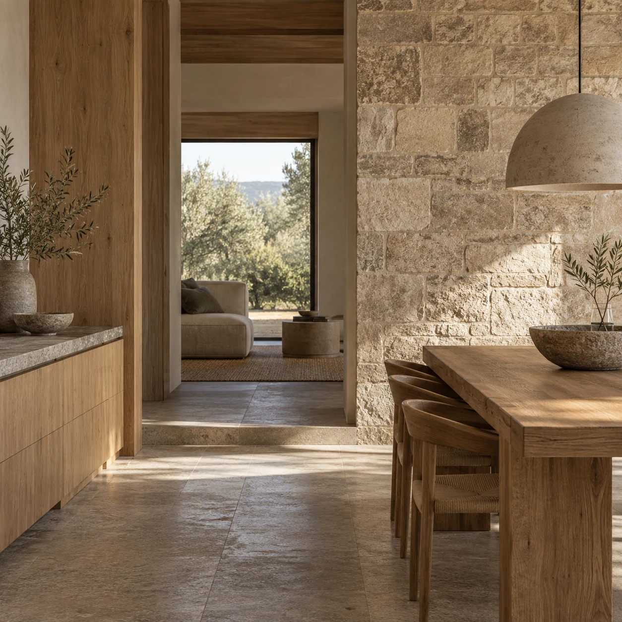
Start with a specific surface
Words such as natural, timeless and authentic can make a palette sound complete before it has been examined. A more useful starting point is a particular surface. What does the timber grain look like? Where does a stone edge meet another material? Is the plaster smooth, lightly textured or deliberately rough? These questions make the discussion concrete and give an image something specific to show.
In Forma's concept work, material character is expressed through a small number of consistent choices. Garden Apartment uses light oak and pale terrazzo. Quiet House combines textured plaster with a timber screen. The distinction between these projects should remain visible even when the images show only a small part of the room.
Avoid giving new images an invented history
A generated image can suggest wear very easily. A darkened edge or uneven surface may imply years of use, but that implication should not become a claim about a real building. The imagery in this portfolio is fictional. Any patina is part of the visual concept, not documentation of a material that has been installed and observed over time.
This boundary matters because an appealing surface is not a durability test. An image cannot establish how a finish will respond to cleaning, weather, impact or a particular environment. The editorial question is narrower: does the texture feel coherent with the material and with the way the room is described? A believable visual study can support that discussion while leaving performance claims open.
Look where materials meet
The junction between two surfaces often tells more than a large uninterrupted field. In Garden Apartment, the meeting of oak joinery and terrazzo explains how storage relates to the floor. In Quiet House, the timber screen beside textured plaster reveals a layered edge. These details belong to the spatial idea rather than existing as isolated decorative close-ups.
A useful detail should retain the proportions and character established in the wider image. If the room shows light oak but the close-up becomes dark teak, the sequence loses its identity. If a screen joint appears to float without support, the image introduces a contradiction. The detail is an opportunity to check the larger concept, not an exemption from coherence.
Leave room for variation
Perfectly uniform surfaces can make a room feel less specific. Small variations in grain, tone and texture give the viewer a way to understand scale. Yet variation should not become random noise. The same material still needs to be recognisable across different camera positions and lighting conditions.
This balance is particularly important when several images are generated separately. Each may be attractive on its own while describing a different palette. Reviewing the whole project set together helps reveal those differences. A contact sheet can make a changing timber tone or inconsistent floor finish apparent more quickly than looking at one full-screen image after another.
Choose a restrained relationship
A limited palette does not mean every surface must be neutral or identical. It means each material has a clear role. The floor may connect spaces, the joinery may organise storage, and upholstery may identify a place to sit. When those roles are understandable, there is less need to add another texture simply to make a view more interesting.
The phrase “age well” is therefore used here as an editorial question rather than a promise. Can we imagine the room accommodating ordinary use without depending on visual perfection? Does the palette have enough character to remain specific, and enough restraint to allow the space itself to be read? Forma's material studies explore those questions through concept imagery. They do not replace product specifications, physical samples or technical evaluation for a real project.
The gallery offers a simple comparison exercise. Look at the floor in the widest room image, then find the same surface in the detail. Compare its colour, texture and relationship to adjoining joinery. Repeat the exercise with the timber. If the two views seem to describe different materials, the set needs revision even when each image looks convincing alone. The purpose of the detail is to add understanding to the room, not to escape the constraints that make the room recognisable.