14 September 2026 · Forma editorial concept
A calmer workplace
Field Office studies the relationship between focus, shared work and conversation. Calmness is approached as a question of spatial clarity, with different activities given recognisable settings rather than a single visual treatment.
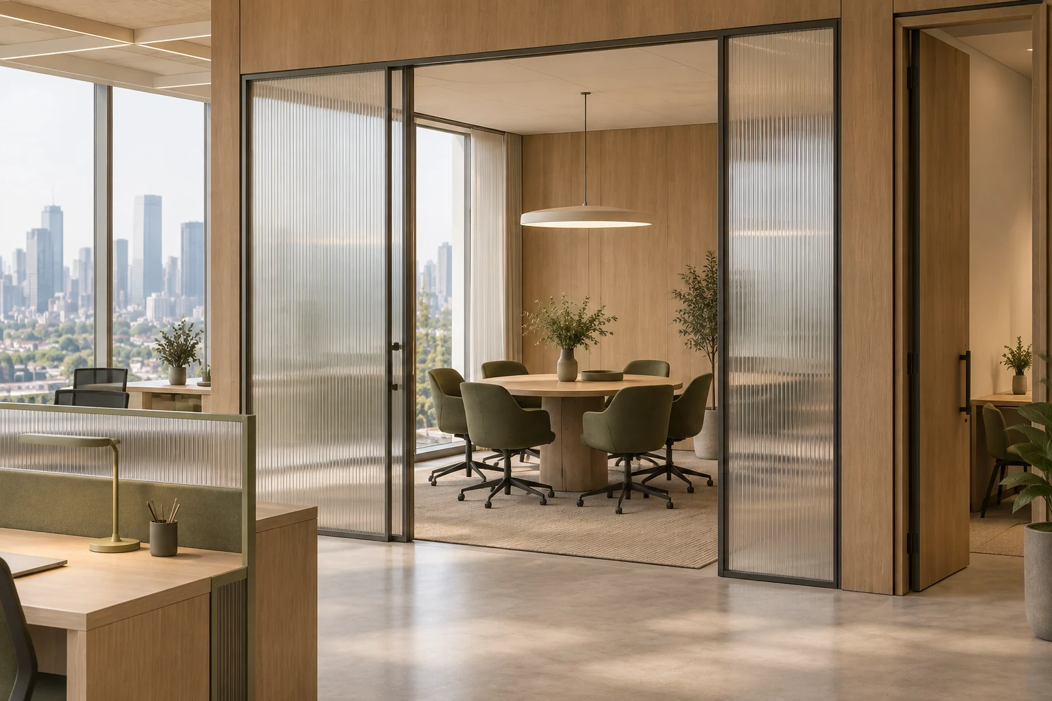
Begin with different kinds of work
A workplace contains more than one activity, even when many people use the same kind of desk. Someone may need to concentrate, another person may be reviewing a document with a colleague, and a group may be discussing an unfinished idea. Field Office begins by making these differences explicit. Its fictional setting provides a way to explore how the activities could be arranged without claiming that one layout will suit every team.
The concept uses a modular framework, but repetition is not the entire story. Shared work areas, focus spaces and a collaboration room each have a distinct relationship to circulation and visibility. The aim is to make those relationships understandable in the images and in the written narrative.
Give movement a place of its own
Circulation can become difficult to read when every open space is treated as somewhere to add furniture. In Field Office, the route toward the collaboration room is part of the organising idea. It should remain visible when desks and chairs are in use. This allows the concept to distinguish movement through the workplace from occupation of a particular work setting.
The distinction is useful when reviewing an image. A clear view of a room is not enough if the route into it is blocked by furniture or disappears between camera angles. The sequence needs to show how one activity leads to another. The circulation image therefore has a specific task: explain a connection that the overall work-area image may only suggest.
Consider degrees of separation
Reeded glass provides a recognisable partition character within the concept. It marks a boundary while retaining some sense of an adjoining space. The choice is presented as a visual and spatial intention, not proof of acoustic privacy. The position of the partition matters as much as its material. A boundary should respond to the activities on either side rather than appearing wherever the composition needs another vertical line.
Focus areas are described through their more contained relationship to movement. Collaboration has a different setting, with a shared table and restrained olive furnishings. These differences help a viewer understand the intended use of each area without requiring signs or a different decorative theme for every room.
Keep the framework consistent
The oak desks, glass profiles and modular arrangement should remain recognisable throughout the gallery. If an image changes the partition spacing or introduces a different office layout, it may be appealing but it no longer explains the same concept. Consistency is especially important for a workplace, where the relationship between several activities is central to the story.
Material details provide another check. A close view of oak meeting reeded glass should agree with the frames visible in the larger room. The image needs plausible support and a believable scale. Decorative perfection is less useful than a junction that can be understood as part of the framework already established.
Use calmness as a question
The word calmer describes the direction of this study, not a measured outcome. The concept does not claim increased productivity, improved wellbeing or verified acoustic performance. Those would require appropriate research and evaluation beyond architectural imagery. Keeping the claim limited makes the design question more useful: can a viewer understand the different work settings and the routes between them?
The answer should come from the sequence rather than from a slogan. Start with the overall work area, look into the focus setting, follow the route toward collaboration and then examine the shared table. Each view adds a different piece of information. Together they describe a workplace organised around several kinds of activity, with a consistent material language holding the spaces together.
When reading the project images, imagine arriving for a conversation with someone already working there. Find the route toward the collaboration room, then look back toward the shared desks. The concept should make these settings distinguishable without implying that every interaction needs to be hidden. Next, compare the focus-area image with the overall view. Their connection should be understandable through consistent partitions and materials. This reading exercise checks the clarity of the story; it is not evidence of how a real team would behave in the space.